Infas360 — B2B SaaS Redesign (Energy Market Data)
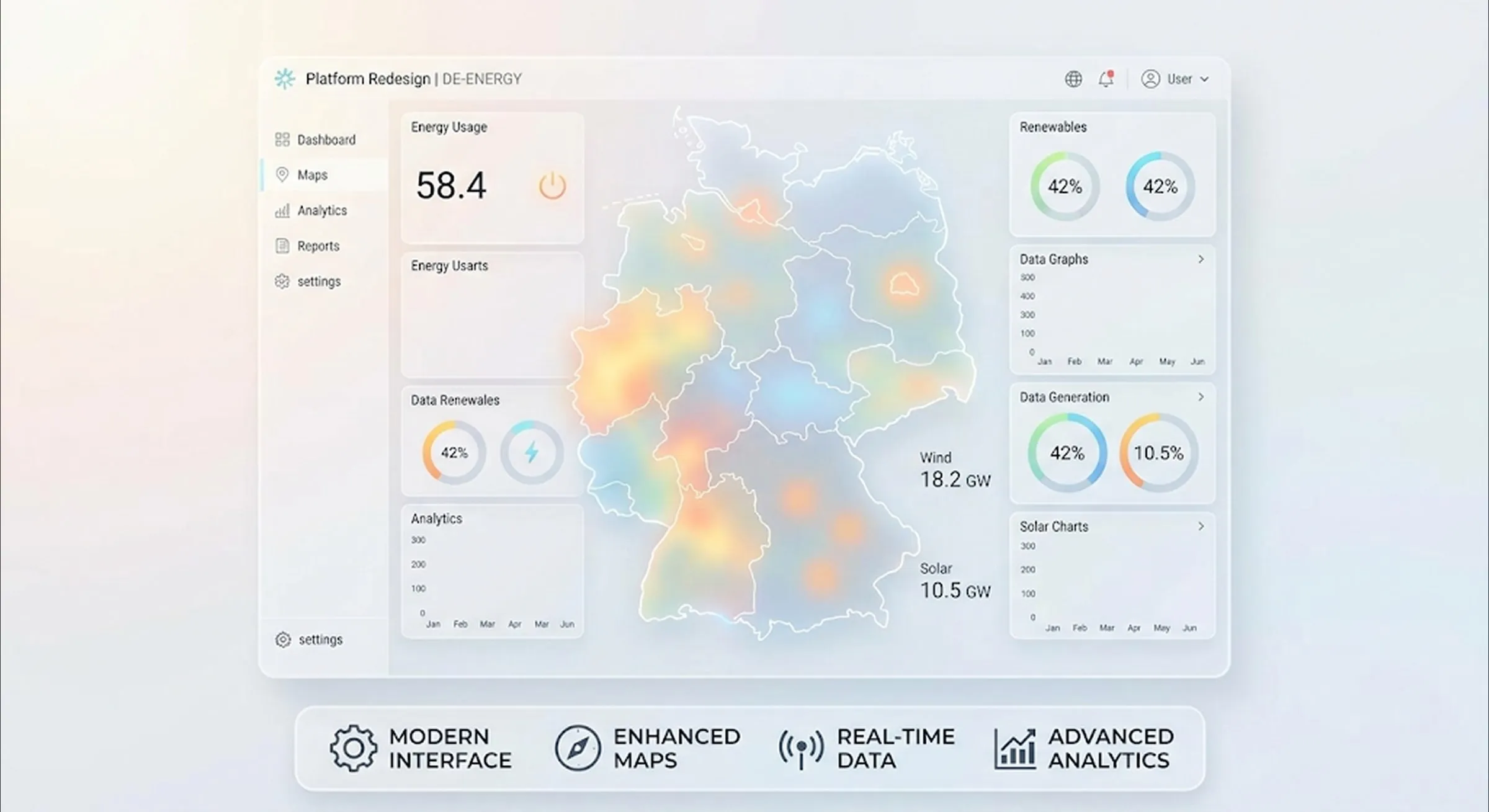
- Client
- Infas360
- Context
- B2B SaaS for energy market data, map-based
- Role
- UX/UI redesign (design phase)
- Status
- Delivered; not yet implemented by the client
- Timeline
- 8 weeks (2026)
- Note
- Previously worked there as a data scientist
Context
Infas360 sells energy market data to B2B customers. The interface hadn't been touched in years: not responsive, no one owning the design. I'd worked there before as a data scientist, with this exact data. I knew what the numbers in these tables meant and what customers needed them for, and could decide accordingly what an interface has to show and what it can leave out.
Decisions
Decision 1
Market Research and a Workshop Before the First Screen
Before the first screen, I analyzed comparable SaaS products that show data on maps, and looked into the energy SaaS niche. Then came a workshop with the PM, engineering, and deliberately also sales, because sales hears from customers struggling with the product every day. Together we worked through the analysis and mapped out user flows and needs. Only after that did I start designing, in iterations, each one checked against PM and engineering.
Trade-off: It takes longer to start than just diving in. But no iteration was built on an untested assumption.
Decision 2
Usage Context as a Design Driver
The same application gets used on construction sites and in the office, two contexts with different needs. On site, what matters is the number, fast. At a desk, it's the deeper analysis. The answer was prioritization: which data does which user need, and how urgently? That led to a compact layout that serves both contexts.
Trade-off: One shared layout for both contexts cuts overhead. Only one design base needs maintaining, not two.
Decision 3
Querying Without SQL
The product's core is data tables. The users are energy specialists, not database administrators. From my time as a data scientist at Infas360, I knew which queries customers actually needed and which ones only existed in theory. I designed a query interface that lets them filter tables and run simple analyses without writing a line of SQL. The real design question was what the interface didn't need to do. It covers the common questions and deliberately skips the rare ones.
Trade-off: A simplified query interface can't do everything SQL can. That's exactly what makes it usable for the people actually using it.
Visuals
Coming soon
Outcome
What I delivered was the complete interface for the application, checked against PM and engineering iteration by iteration, plus a UI kit for the marketing pages. Since then the team has been able to build new pages on its own, in one consistent design language. In the final dev handover, the developer could clear up open questions and hand back notes for revisions. The client hasn't implemented the redesign yet. This case study shows the decision-making process: how I make product decisions on a data-heavy interface. That's exactly what I get hired for.
deutschland-forstet-auf.de
Next case study