deutschland-forstet-auf.de — Platform Relaunch
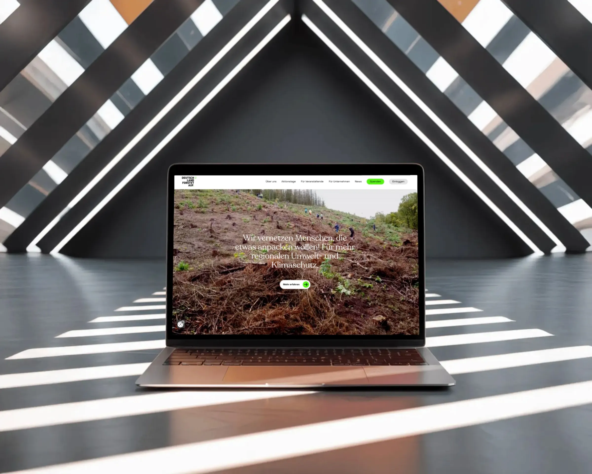
- Client
- Deutschland Forstet Auf (nonprofit)
- Role
- Frontend and backend development; UX fixes during implementation
- Timeline
- 6 weeks (2025)
- Scope
- Relaunch including event management and email automation
- Stack
- Astro · React · Storyblok · Supabase · NestJS · Express · Storybook · Netlify
Context
The platform connects volunteers with reforestation drives across Germany, run by a small, mostly volunteer team. The old site was technically outdated, and the organization wanted more: a new design to reach more people, plus features it never had before, including organizing planting drives, managing events, and automating email. The design came from a designer, the backend from a fullstack developer, and I built most of the frontend.
Decisions
Decision 1
Thinking Designs Through Before Building Them
The designs I received showed the ideal case: one viewport, short content, no exceptions. Responsive behavior, edge cases, and implementation cost weren't part of that. That's normal, and it's exactly the point where I don't just "implement." I checked every layout against three questions: What happens with different content lengths? What happens on other viewports? What does this cost in implementation and performance? Where the answer was missing, I defined it myself, while keeping the design intent instead of simplifying it away.
Trade-off: Feasibility checks cost time before the first commit. In return, they save three times as much on a layout that falls apart on a phone.
Decision 2
The Card Grid: A Concrete Example
The design called for a 4x2 grid of cards, deliberately breaking grid: cards tilted alternately left and right, the second row mirrored, every other column offset on the Y axis. On the desktop mockup, it worked. Everything else was open: How does the tilt behave with long titles? When does the grid break to 2x4, when to a single column? Does the offset survive on a phone, and if so, which one? I worked out the logic behind it: rules for tilt, offset, and breakpoints that work on every device and with any content, without losing the dynamism of the design.
Trade-off: Rules make the layout less free than the mockup. In return, it behaves predictably instead of being renegotiated with every new piece of content.
Decision 3
Content and Code, Strictly Separated
Everything editorial, meaning planting drives, text, images, lives in Storyblok, not in the code. The page structure lives in the code, not in the CMS. The team can't invent new page types without asking. In exchange, it can handle everything else on its own, without accidentally breaking the site through routine content edits.
Trade-off: Less flexibility for the team, no dependency on a developer for day-to-day work. For a volunteer-run platform, that's the right cut.
Visuals
Coming soon
Coming soon
Outcome
The site is live and carries the organization's day-to-day operations, from announcing planting days to event management to automated email. The team has managed the content on its own since handover.
Anmo art/cha
Next case study